Nearby
Project Scope
Background
Defining the Feature
Design Considerations
User Testing
Post-Launch
Gallery
My Role
- Product Design - User Research -
- Usability Tester - User Acceptance Tester -
Platform
- Mobile
Tools
- Adobe Illustrator - Balsamiq -

Background
PipelineDeals completely rebuilt our mobile app in the summer of 2018. The focus of the rebuild was reliability and parity with the core functionality of the web-app. The goal was not to create a mobile app that had the exact same functionality as the web-app. The goal was to build an app that provided key tools to our users while they were on the road or away from their desk. For the first six months after we released the new mobile app, the focus of the product/engineering teams was to improve the UX, fix bugs and build core functionality that was missing from the web-app.
Once we felt like the mobile app was performing up to our standards and there was parity between the web-app and mobile app we wanted to build a feature that was specific to the mobile app. A mobile CRM has many different use cases than a web-based application that is typically being used on a laptop or desktop computer. We knew there was specific functionality we needed to build in order to make the PipelineDeals mobile app more valuable and sticky with our users.
To decide what this feature was going to be we utilized survey data, customer feedback and information our customer success team had gathered while talking with key accounts. A survey had been sent out to our entire user-base while the mobile app was being built to get a gauge on mobile trends and what features our users were currently utilizing the most and what features they thought would be most useful in a mobile CRM. The results of this survey were highly skewed towards mapping and routing functionality. Users wanted to be able to look at their CRM data on a map. This information was backed up by the product feedback we had gathered since the release of the mobile app as well as the information our customer success team had gained while conducting business reviews. The results so heavily favored map functionality that it was a fairly easy decision to make this the focus of our next mobile feature.
Defining the Feature
To start, I received a broad set of requirements from my product manager. It was up to me to gather more research and define exactly how this feature would perform and what the UI would look like. This part of the design process included four steps:
User research
Persona creation
Technical requirements from engineering team
User flows
User Research
The MVP for this project was initially scoped to be released in 6 weeks. This gave me very little time for the research and design phase. In order to reach the most amount of users, I decided to use a survey to gather user research. I wanted the results to be very focused so I kept questions very specific and then targeted a narrow user group. I only sent the survey to users of the mobile application who had been active in the past 6 months. I felt this was necessary to get information from users who were actively using our mobile application.
The results of the survey were very helpful for defining the user persona, typical use-cases and narrowing the scope of the requirements. It also generated a pool of users that we could reach back out to when we needed to user-test the MVP.

Technical Requirements
I wanted to meet with the engineering team early in the planning phase because I had a hunch that we would be utilizing other technologies in order to complete this feature. I gave them a very high-level description of this feature and asked them to do some research on how we could accomplish that. Utilizing their expertise and the expertise of services would be vital to completing this project as quickly and efficiently as possible.
Based on their research, they informed the product team that in order to be able view records on a map that we would have to geocode the addresses that users had input into our system. Geocoding essentially means turning a street address into a datapoint with a longitude and latitude. Once an address is converted into a geocoded latitude and longitude point we could pinpoint it on a map. There are a variety of services that will geocode addresses. The services ranged in price, accuracy and speed. After weighing the options we ended up deciding on a service called LocationIQ.
User Flows/Use Case
Dave has a meeting scheduled the next day in a nearby town with a new distributor lead. Since he is making a trip to a different area for one meeting he wants to make the most out of time on the road. He would like to use the PipelineDeals mobile app to see what other leads and customers he has in the town he will be visiting and along the way. Being able to easily contact the person or company he is going to attempt to visit will be imperative since most of these visits will be made with little notice. He would also like to be able to easily access the profile pages of each record in order to refresh himself on where the relationship is at.

Problem
For many of our mobile app users, they are on the road and are trying to visit as many leads or customers as possible. The current functionality in the mobile does not allow users to filter records by location. If the user creates a list on the web-app that is filtered by location it is still not intuitive to look at locations in a list format and decide which ones are easiest to visit. When deciding which locations to visit, it is important to quickly be able to view the profile page in order to get an update on the status of the relationship. Once the user has decided which location they want to visit it needs to be able to route your way to that location. These are the core problems I aimed to solve in my design of this new feature
Solution
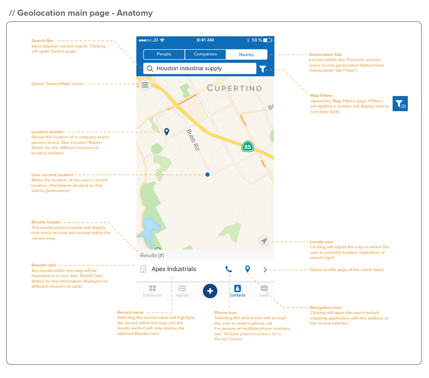
We needed to build a feature that would allow users to look up any record that had an address associated with it on a map. For us, that meant being able to look up people or company records. Once a user looked up a record, they could adjust the map in any direction and see who else was around the record they searched for. The names of the records would need to be easily visible. At that point, the user would be able to perform any essential action.
Place a phone call.
Open up the record address in an external mapping application.
Go to the profile page of that record in order to get more detailed information or enter an activity after an interaction.
These were the essential actions that we had decided were most important based on our research and talking with customers.
Not the Solution
One of the most common pieces of feedback we received during the discovery phase of this project was that users were looking for a feature that would help them create the most efficient route between a set of customers. Not just choosing a single location and finding the directions to it but selecting a set of locations and having a feature that would map the most efficient route between them. Based on the amount of feedback we received about this functionality it was an area we wanted to explore.
I did research into a variety of applications that were doing anything semi-related to this and looked at how we could accomplish the same thing. After doing a fair amount of research I came to an important decision; we should not try to build this feature. I’ve always believed that products are better off doing one thing really well, rather than doing multiple things okay. The same can be said about individual features. There were standalone CRM’s that focused solely on route planning. The product team decided that the resources and time we had available to build this feature would not be sufficient for providing a feature we could stand behind. Instead building a mapping feature and and routing feature that would partially satisfy all of our users we decided to build a mapping feature would work extremely well.
Design Considerations
Multiple Records at the Same Address
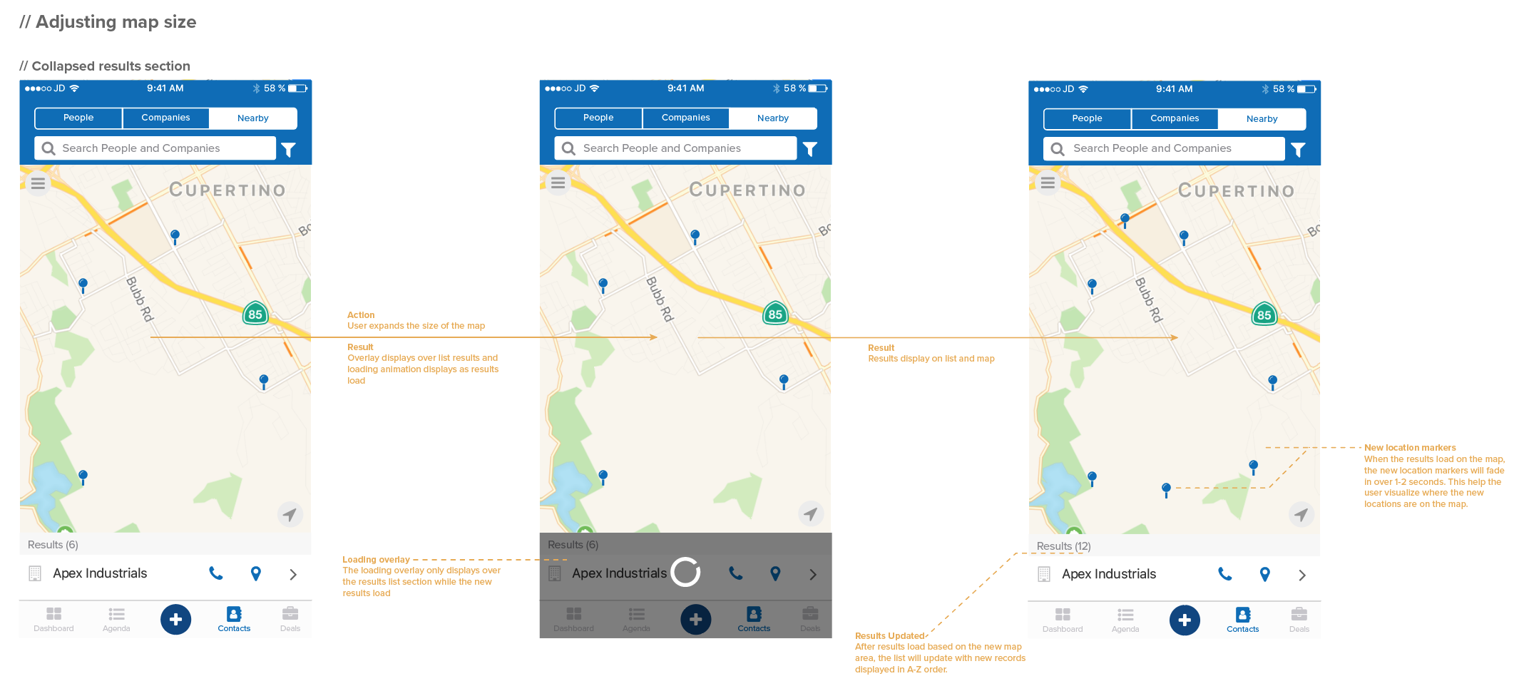
An important piece of this design was accounting for records that might share the same address. A very common example of this is a company and the people associated to that company who all share the same address. The user needed to be able to search for all of the individual records but also recognize from the UI that they all shared the same address.
The way I represented this in the UI was to create unique location markers that would symbolize what type of record was at that location. Initially, I had wanted to display the name of the record in a tooltip in order to make it very clear which record the user was seeing on the map. Based on the amount of space available this was going to be hard and would also not be conducive for representing multiple records at a single address. I decided to create location markers for each type of location (people, company, or any combination of the two). I used the people and company icons that were already being used in the app in order to create a tooltip, style marker at each location. Since this icon was already familiar to our users it would be easy to make the connection between the icon and type of record at that location. Representing a location with an icon would also take up much less space and would quickly convey the important information to the user.

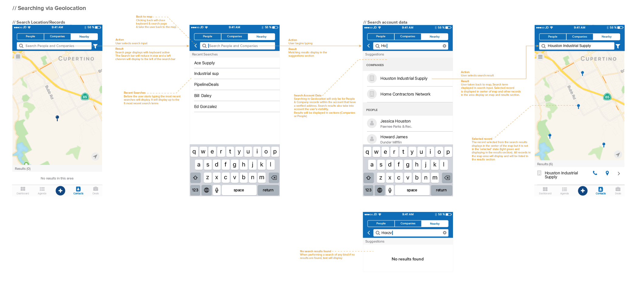
Filtering
Based on the technology we were using, users would not be able to look up specific addresses, cities or states. They would only be able to search for the names of people and companies. For this reason, I wanted to make it as easy as possible for users to find the correct records with the minimal amount of searching. Providing filters would be the best way to do this. The first filter to implement was people and companies. Users primarily work with people or companies as their primary record type besides deals. By providing the people/company filter users could instantly remove their non-primary record type and just look at the record-type they use.
The next filter I wanted to implement was people and company custom fields. Custom fields are one of the most valuable components of our product. They allow our users to create any field they want in order to account for their unique business processes. For this reason, I felt it would be extremely valuable to have these fields available to users.
In one of the first design workshops, where I held a design review for this feature the custom field filters were cut due to limit the scope of this project. Our product manager had concerns about the extra time it would take to build this functionality and the engineers had concerns about the load times since there are no limits to how many custom fields an account can have. For these reasons, we decided to add custom field filters to the backlog and initially release this feature with just people and company custom fields.

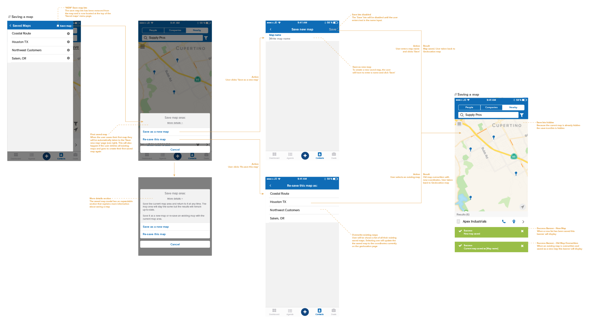
Saving maps
Since users were not going to be able to search for specific locations or create routes between records I tried to think of other features that would allow them to get close while working within the confines of technology and development time we had. The idea I came up with was the ability to save maps.
Navigating the map to focus on a specific city or region and saving that map so you could easily return to it is an alternative method for searching for specific locations. Users might not be able to route the perfect driving path between a set of locations but by being able to save a map area that they travel to continuously and save that area with their ideal filters in place they could save a series of routes that they were commonly visiting.
There will never be point in product development where you don’t have boundaries to work within. Our boundaries would not allows us to build specific functionality. By using a little bit of creativity I felt that the saved maps functionality would get our users closer to the ideal experience while working within the constraints we had.
User Testing
At the point we had about 95% of all functionality built out we wanted to test this feature with some of our users. We used the survey responders to create a pool of potential testers. We set up meetings with 5 users. At this point, there was no way for users to test the feature on their own phone so we had to get creative.
I created a series of tasks that would test out various aspects of the app. For each test, I prepared a script to read to the user that would explain how the test would go and what I expected of them. Then, I would share my mobile screen and ask them a task. Since the user had to explain where to press, it gave us great insight into their thought process and how they were seeing the UI. At the end of the tasks, I asked some general questions to get overall impressions of the feature.
Feedback
The first main piece of feedback we heard was that this feature was going to be extremely useful for them and their users. This was very encouraging to hear right off the top. Testing participants told us how much easier this would make finding locations rather than using a list. After hearing this feedback, we felt that our original hypothesis was validated and that this feature was definitely going to solve a problem for our users.
There was a handful of usability issues that arose during the testing that we felt had to be addressed before releasing this feature to our entire user-base.
Custom field filtering - In 4 out of the 5 user tests we heard users specifically say that it would be really helpful to sort by custom fields. I asked them to describe the use case for custom field filtering and they described a user story that seemed very relatable to many of our users. Despite the concern from our engineering team and projected timeline we decided it was worth exploring more. It helped that we were actually ahead of schedule on the development of this feature and to make matters even better, our engineers researched the technical aspects more and felt that this would not affect processing times negatively. In the end, we decided this feature was worth the time to build prior to our wider launch.
Easier access to profile pages - Navigating to the profile page of a record was a primary function to include in this feature. The profile page includes detailed information on the record and it is where the user would look up past activities and record new activities. There were multiple tasks that included going to a profile page and users were having a hard time recognizing how to do that. In the user tests, users were selecting the name of the record in order to try and go to the profile page. Selecting the record name from the list of results just highlighted that record in the map and isolated that record in the results section. Clicking the record at any point after that initial selection didn’t have any effect. I felt that once the record had been selected the name of the record was a primary button that didn’t do anything. I also realized that having the same button perform two different actions was UX faux pas. I had to make a decision between what the user expected and breaking a UX guideline. As I took into consideration all of the factors at play, I felt that in this use-case it was acceptable to have the initial click select the record and the second click take the user to the profile page. Since releasing this feature, the metrics show us that navigating to a profile page from within the Nearby feature is in the top three actions performed by users. This data helps validate the decision and users are more easily able to perform that primary action.
Post-Launch
After making the updates that came out of user testing, the product team coordinated with our marketing team to release this feature. The product marketing for Nearby included, featuring it in our monthly newsletter, adding a pop-up modal to the newest version of the mobile app, and adding information about it on our marketing site. We felt that publicizing this feature was very important to its success. The core users of this feature had most likely found a workaround using other tools and we wanted to make sure they knew there was geolocation functionality within the PipelineDeals mobile app.
Once the newest versions of the mobile app hit the Apple and Android store we monitored our metrics as well as our customer support channels to see if there were any issues. No bugs or major issues have arisen up to this point. The metrics have shown us consistent use from a dedicated group of users but not the overall usage that we would have liked to have seen. More research and analysis will need to be done to discover if this due to usability, functionality, or a lack of awareness.
Future Enhancements
Since the initial launch, there are already a few enhancements that I would like to make to in order to make this feature more effective and usable.
Clearing custom fields - Adding the people and company custom field filters was an enhancement we made after user testing. Custom field filtering was a great benefit to our users but implementing this feature right before launch didn’t give us a chance to do thorough user testing and catch any usability concerns. What I had missed with the inclusion of this functionality was that users could have a very large amount of custom field filters that they could apply. This presented issues when the user was performing a search for a record and might not see the record they searched for because of a filter that had been applied. Currently, the user has to select the filter button, clear the filters and then return to the map to see the full list of results. This felt like far too many clicks to clear the filters in order to see the full results of the map. The solution I designed added a minimalist banner when the user performed a search when there were filters applied. This banner would provide the user a secondary queue that there are filters applied that might affect the results they are seeing and it would also allow them a 1-click option to clear all the filters that were currently applied. This solution will be released in the next mobile app update and will improve the usability of filtering and searching.
Nearby for the web-app - In the research phases of this project, geolocation seemed like a perfect functionality to pair with the mobile application. That hypothesis has been validated based on usage and customer feedback but a common request that we have received since releasing the mobile app is to build a similar feature for the web application. I have followed up with one customer who had this feedback to ask about the use cases for the web-version of this feature. They told me that they like to use Nearby for on-the-go, impromptu meetings but that very often they are setting up meetings weeks in advance. This is typically done on a computer, in the web-application. They said if we could combine the functionality of creating lists (in the web-app) and the mapping UI (in the mobile application) this could be an extremely powerful tool for them. It would also be a great complement to the mobile application. Based on this feedback, Nearby for our web-app is on our product roadmap.
For our first mobile-specific feature, Nearby as been a great success. Users are finding great value from it and the fact that the entire product development process took 6 weeks to complete we feel that it was well-worth the investment. The first version of Nearby has given us a great foundation to build off of and we will continue to analyze the metrics and collect user feedback to figure out where future iterations will take it.
Gallery